

Few franchises in NBA history built a visual identity as immediately recognizable as the Seattle SuperSonics. From a rocket-powered lightning bolt in 1967 to the gold-threaded arches of their final season, the Sonics' uniform history tells the story of Seattle itself. Here's every major era.
1967-1969: The Lightning Bolt
When the SuperSonics entered the NBA in 1967, they weren't playing it safe. While most franchises leaned on traditional block lettering, Seattle debuted a jersey with a bold, electric wordmark underlined by a sweeping lightning bolt, with the "i" dotted by a star. The name paid homage to the Boeing 2707 supersonic transport. One of the most distinctive debut looks the league had ever seen.
Colors: Deep forest green and gold. Signature detail: Lightning bolt underline beneath "SONICS."
1969-1975: The Script & Cartoon Years
Over the next several years the Sonics went through two distinct looks — first a softer cursive script, then an almost cartoonish diagonal wordmark in 1972. Yellow became the default home jersey color through much of this stretch. This cartoon-era look would later become a popular throwback in the '90s.
Colors: Yellow home, green road. Signature detail: Diagonal cartoonish "SONICS" lettering.
1975-1978: The Transition Era
White jerseys returned as the home uniform, yellow was put on ice, and the cartoon lettering gave way to sharp clean block font. These are the jerseys worn by the team that would eventually break through into championship contention. The skyline era was almost here.
1978-1995: The Skyline Era — The Greatest Look in Sonics History
This is the one. The "Sonics" wordmark arched across the chest — green arch on white home jerseys, white arch on the green road set — framed by gold trim. The iconic Seattle skyline logo, with the city's silhouette visible through the panes of a green and gold basketball, became one of the most beloved marks in sports. These uniforms carried the Sonics to their only championship in 1979, and later introduced the world to Shawn Kemp and Gary Payton.
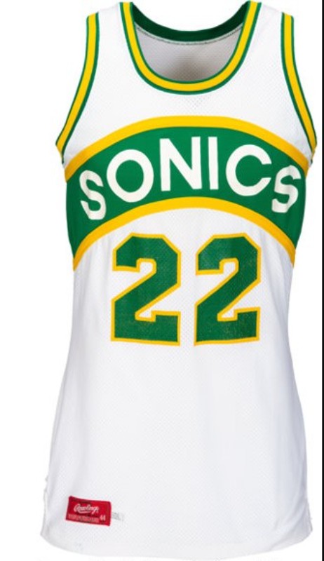
Seattle SuperSonics 1977-1989 Home Jersey — Championship threads — 1978-1995 Skyline Era
Notable moment: The 1979 NBA Championship — the only title in franchise history.
1989-1995: The Reign Man Years
Same skyline look, legendary players. Shawn Kemp was dunking over half the league while Gary Payton locked down every point guard in the NBA. A 63-win regular season in 1994 made the city believe a title was coming. The skyline arches never looked better.
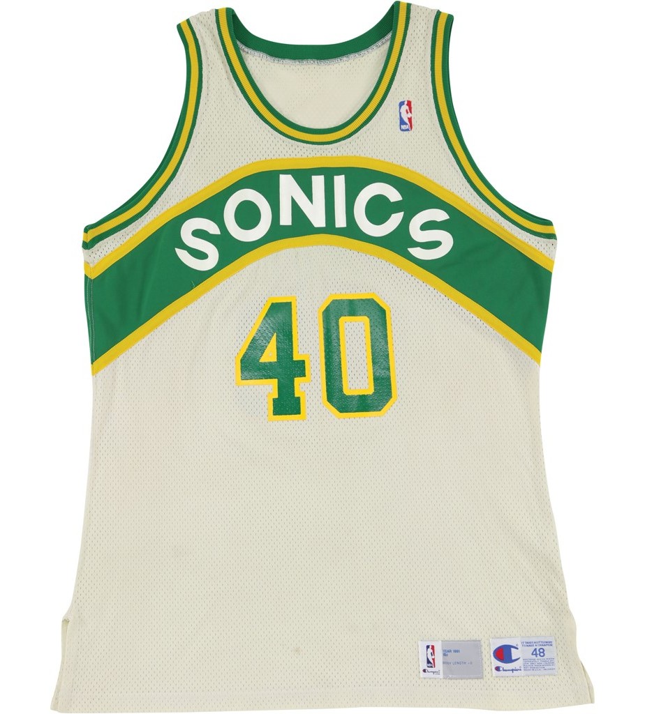
Seattle SuperSonics 1989-1995 Home Jersey — The Reign Man Era — 1989-1995
1995-2001: The Nineties Rebrand — Space Needle & Red
After back-to-back first-round exits, the Sonics tore it all down visually. The skyline logo was retired. Yellow disappeared. In came a bronzed red — the first and only time red ever touched a Sonics uniform. The Space Needle replaced the skyline, now serving as the "i" in Sonics, orbited by a basketball. These jerseys went to the 1996 Finals and pushed Michael Jordan's 72-win Bulls to six games.
Colors: Green, white, bronzed red. Notable moment: 1996 NBA Finals.
2001-2008: Back to Green and Gold
Under new ownership, the red was gone. The arched chest band returned in deeper shades of green and gold. Yellow came back as a primary color for the first time since the '70s. Ray Allen, Rashard Lewis, and a young Kevin Durant wore these — making them both beautiful and heartbreaking to look back on.
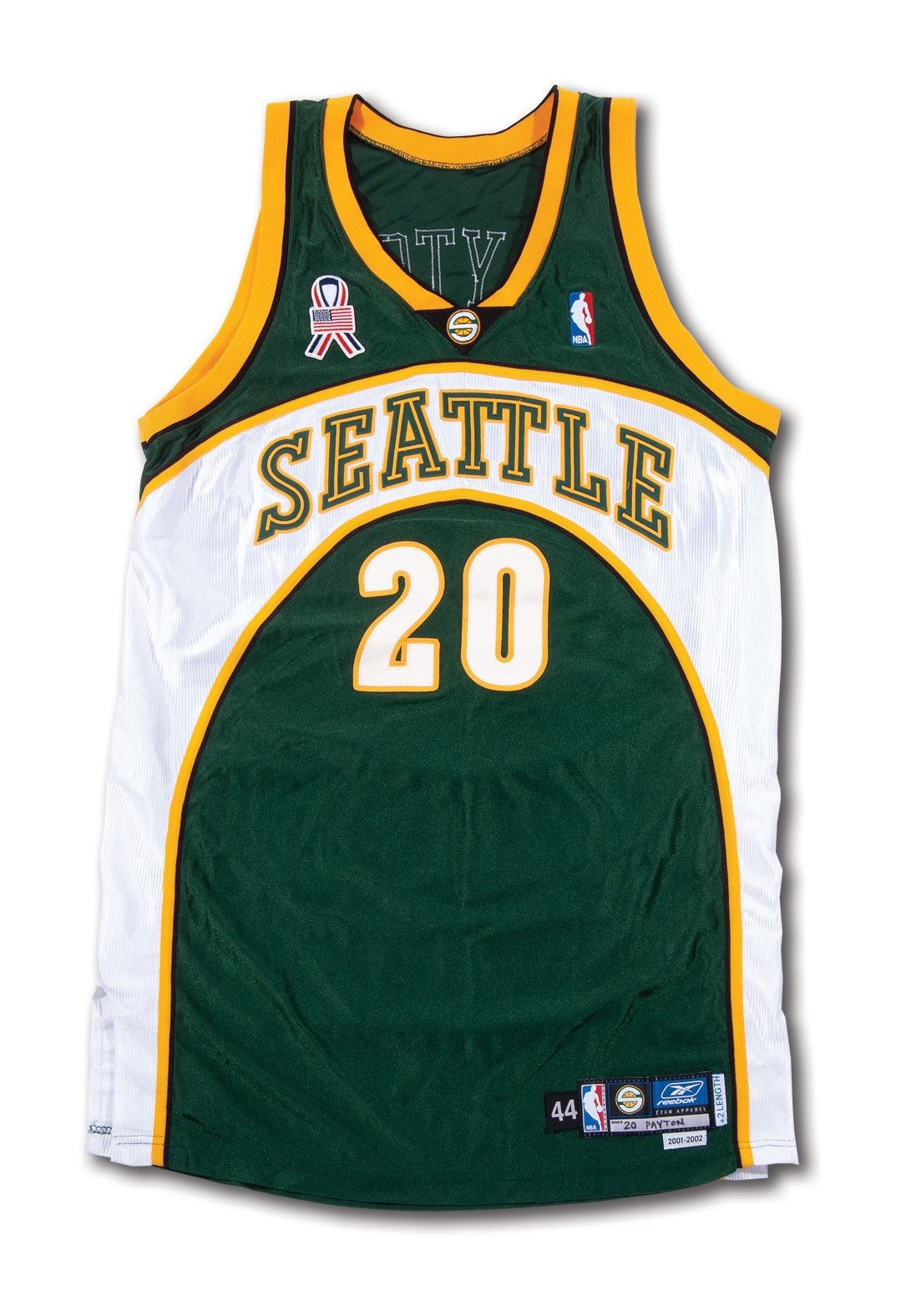
Seattle SuperSonics 2001-2002 Away Jersey — The Final Era — 2001-2008
The Legacy in Green and Gold
The Sonics are gone but their jerseys live on — on walls of Seattle bars, in closets across the Pacific Northwest, and on the backs of fans who refuse to let the history die. When the day comes that basketball returns to Seattle, we all know exactly what the jersey should look like.